We’ve been developing software for 19 years, and during 15 of these years, developers have written it primarily for experienced specialists. They focused on the technical side of the platform and new functionality, not paying much attention to how to display all these new features in the interface. Not so long ago, we decided to change our approach. Now when designing AggreGate Platform we take into consideration both the technical side and how all these capabilities are represented in the interface to make it user-friendly.
The most important thing for us — to make using the platform as easy as possible and create a new user experience exploring the power of our product even for those who have never worked with such software. Usability became the priority for us and well-thought-out platform design — the new big task. Therefore, a whole team of professionals started designing a new web interface. We thoughtfully approach the design of the high-quality user experience from the very basics, so the first changes have affected the appearance and such components as buttons, fields, radio buttons, etc. As they say, a little goes a long way. You’ll see the first results of our effort as early as in AggreGate Release 6.0 and further updates in minor releases (6.1, 6.2, etc.).
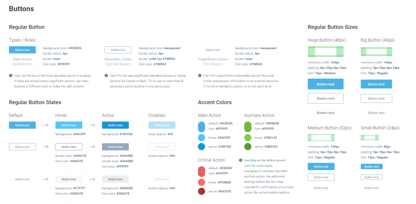
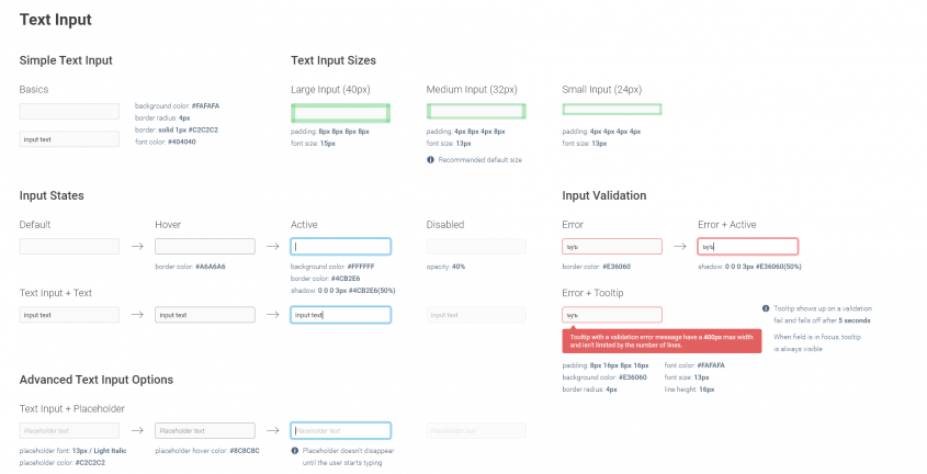
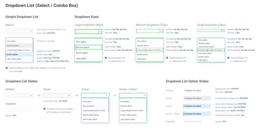
Enough words, just have a look at some of the new components and stay tuned! 😉


